7 Best T-shirt Logo Design Ideas for Promotional Branding in Redbridge, Ilford
7 Best T-shirt Logo Design Ideas for Promotional Branding in Redbridge, Ilford
In the world of promotional branding, t shirts are a go to promotional product for most of the businesses. Since t shirts are worn by everyone everywhere in Ilford, be it a morning walk, or going for grocery, an evening time out with your spouse and your pet or your daily gym, they provide a huge audience for your brand to be witnessed wherever they are worn.
On the other hand, the image which best describes your brand’s personality and identity and symbolizes your business is none other than your logo. Combining these two, we have:
T SHIRT + YOUR LOGO = BEST PROMOTIONAL PRODUCT
How ever, not all logos are created equal. Some logos may look great on a website or a business card, but not so good on a t shirt. There are many factors that can affect how well a logo translates to a t shirt, such as the size, shape, colour, complexity, and style of the logo.
Let’s explore some of the types of logos that are suitable for t shirt printing, and some of the tips and best practices to follow when designing or choosing a logo for your t shirt brand.
Types of Logos for T Shirts
There are many different types of logos, but they can be broadly categorized into the following:
Wordmark Logos or Logotypes:
A wordmark is a font-based logo that consists of the name of the brand written in a distinctive font or style. Examples of wordmark logos include Coca-Cola, Google and FedEx. Wordmarks are simple, memorable, and easy to read. They can also convey a lot of information about the brand’s personality and tone through the choice of font, colour, and layout.
Typography is also an important decision to be taken when it comes to word mark logos. You may find a variety of formal, informal, fun, script, heavy or light fonts in different weights according to the nature of your business and the target audience of your brand.
Also read: Selection of typefaces and fonts for printing and embroidery and Typography Trends in T-Shirt Designs In Essex London
Lettermarks or Monogram Logos:
A lettermark is another typography-based logo which comprises of a few letters, usually a company’s initials. The businesses with lengthy names rather go for their initials as their brand identification thus making a lettermark or monogram for them. Logos like IBM, CNN, NASA are all lettermarks.
Pictorial marks or Logo Symbols:
A pictorial mark is a graphic based logo that consists of an image or icon that represents the brand or its product. Examples of pictorial mark logos include Apple, Nike, and Twitter. Pictorial marks are versatile, expressive and recognizable alone.
They can also evoke emotions and associations in the viewers’ minds for e.g., World Wildlife foundation logo with the image of a panda to draw attention towards an adorable and endangered species.
These logos are suitable for businesses with a strong brand identity and for a new entity without brand recognition they may not work.
Abstract Logo Marks:
An abstract mark is a logo that consists of a geometric or abstract shape that represents the brand or its concept. Examples of abstract mark logos include Adidas, Pepsi, and Airbnb. Abstract marks are modern, creative, and distinctive. They can also convey a lot of meaning and symbolism through the use of shapes, colours, and patterns.
These logos symbolically convey what your brand does going beyond cultural and regional implications of a particular object. For e.g., the swoosh of Nike representing movement.
Combination Marks:
A combination mark is a logo that consists of a combination of text and image, either integrated or separated. The text and the mage can be either laid side by side or stacked one on top of another to create a logo.
Examples of combination mark logos include Starbucks, Burger King, and Lego. Combination marks are versatile, descriptive, and memorable. They can also combine the strengths of both wordmarks and pictorial marks.
Mascot logos:
These logos have an illustrated character, cartoonish and fun to represent the brand. These illustrated characters are the ambassador of the business and are quite attractive to the people.
KFC’s Colonel and Planter’s Mr. Peanut are mascot logos which represent the background of the business.
Vintage Logos:
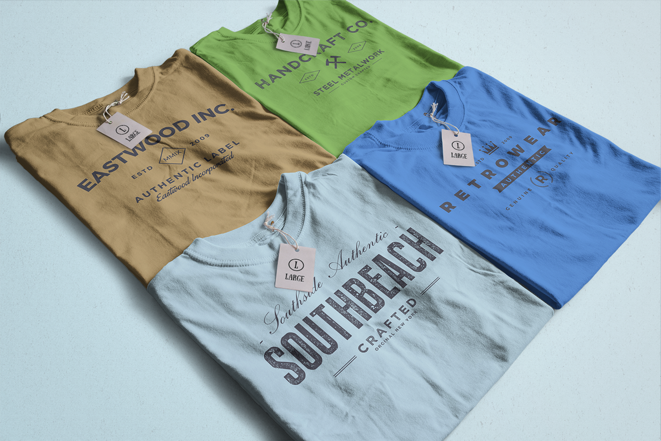
Usually created in wordmark style these logos look very creative as they present a classy retro vibe of the old era. A brand which has been around for some decades and has a rich history to tell goes for a vintage logo design.
These logos designed with a vintage vibe manifesting the aesthetics of the era embodied in them, are easy to identify.
Selecting a Logo for Your Brand
When creating or choosing a logo for your brand, remember to follow some basic tips and practices:
– Choose a logo that relates to your brand’s name, product, or message.
– Choose a logo that is simple and recognizable.
– Choose a logo that is unique and original.
– Choose a logo that is scalable and adaptable.
– Avoid using too many colours or effects in your logo.
– Avoid using generic or clichéd images in your logo.
– Avoid using too long or complicated texts in your logo.
Tips for Printing Your Logos on T shirts
- Logos for t shirt printing should not be too long or complicated. They can be printed in a large size across the chest or back of the t shirt, or in a smaller size on the sleeve or pocket.
- Wordmark and letter mark logos can also be combined with other elements, such as icons or shapes, to create more interesting and unique designs.
- The colour selected for t shirt should be a good contrast to the colour of your logo to ensure visibility. Stick to one or two colors that complement each other and your brand’s identity.
- A t shirt with a logo should not be cluttered with other designs or patterns nor it should be too busy and crowded so that the brand is totally noticeable to the audience.
- Avoid using too many effects or embellishments on a t shirt with your logo. They can also make your logo look messy and unprofessional on a t shirt. Keep your design clean and simple.
For best printing of your logos on t shirts in Redbridge, Ilford, London, UK checkout our Personalised Section

